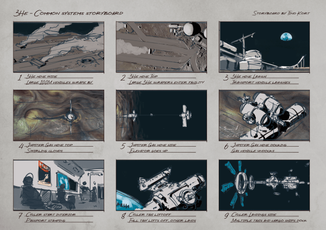
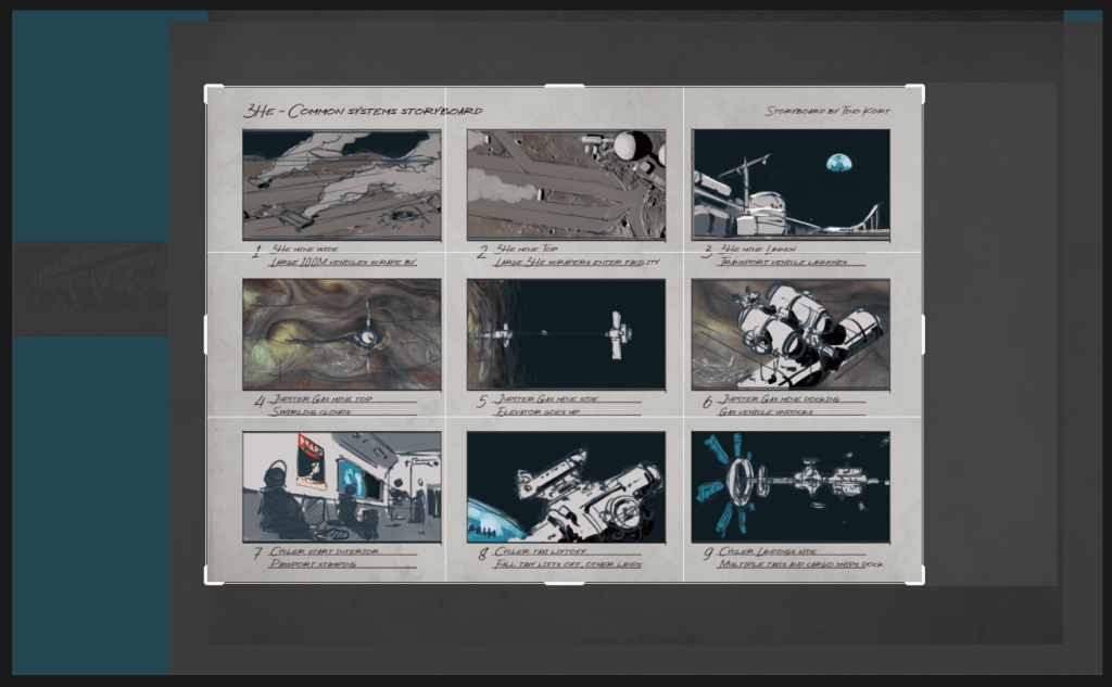
A while ago i was working on a new storyboard for 3He, a sci-fi project i’m resurrecting. Talking with and thinking about it myself, it came up that often things are painted on top of templates, which can be frustrating to keep between the lines and still read as a filled out scene. Similarly it makes it hard to crop images that may exist, or reposition your work as you go.
That’s why i made this simple diagram that shows how i do it:
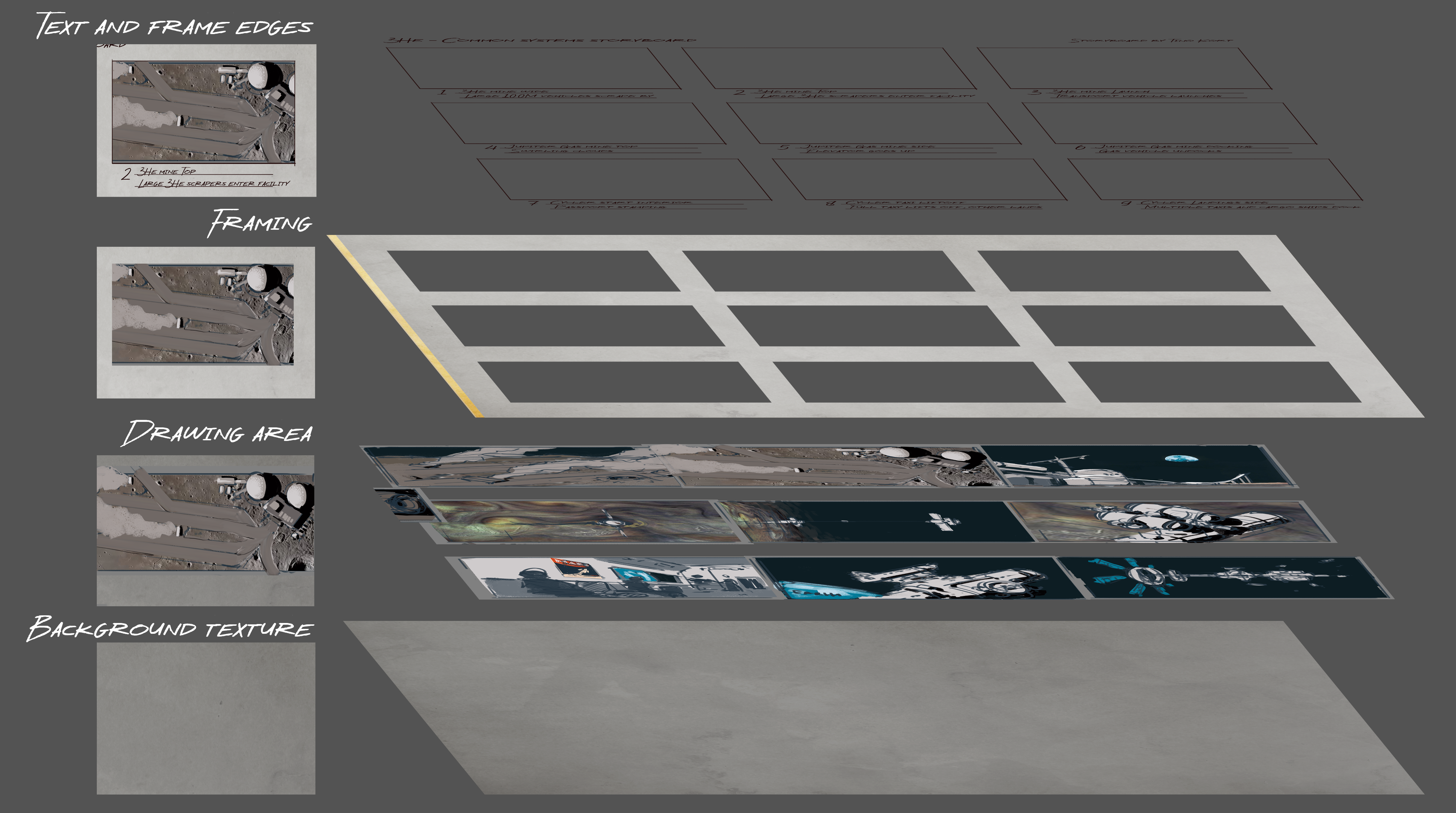
Basically, i try to have a background layer of texture on any project i start nowadays. It’s easier to start on and is not as offensive as a white screen staring at you. Looks less digital as well.
Above that, i have a drawing area, which is often made up of background colour, midground sketch layer and sometimes i paint on top of that. You can insert any image here at any size, you do not need to keep in mind the aspect ratio.
Then there is the frame layer, basically a brightened background layer with holes that you can see the image through.
On top of that is some frame embellishment (a couple lines to demarcate where the frame is supposed to end, in the event the image underneath has a similar value) and text for clarification. Any “overdraw” camera movement sketches should go UNDERNEATH the text, but ON TOP of the frame embellishment.
Last but not least, be sure to click this little fella, to turn off your pixel deletion from the inevitable recroppping you do to the template.

As you can see, my template extends far beyond the file, which is the case in 99% of any of my paintings and drawings. it’s a pain to lose these pixels and have to outcrop later again.
Hope this was of use, Hope to see ya soon! If you have any questions just send me a message.
